
Have you asked yourself, “What is Responsive Web Design?” Responsive web design is a way for the designer to create a “responsive” or “resized” Web page depending on the type of device seen from it. This may be a large desktop computer screen, a laptop computer, or devices with small screens, such as smartphones and tablets.
In short, responsive design allows your site to adapt to the device users are using. It provides an important feature that is to write content once and be available on all devices with different sizes, which means less work for you.
Responsive web design has become an essential tool for anyone, an organization, or a company with a digital presence. As smartphones, tablets, and other laptops grow, so more people are using smaller screens to display web pages in general.
Why do you need your site to be responsive?
You should also take into consideration the update announced by Google in April 2018, entitled “Mobile first” and adding “mobile compatibility” as a ranking factor. Small businesses then started increasing their presence on mobile, either by making their website responsive, or by developing responsive designs for e-shops and other pages to make it easier for users to access various devices across the company.
What is responsive web design?
Responsive web design is a web design technique that makes web pages look good on a variety of mobile and desktop devices with different screen sizes. Content, design and performance are essential across all devices to ensure ease of use and user satisfaction to ensure a unique user experience and satisfaction. This is why you should seek the services of a website design company in Saudi Arabia that provides the best design services of all kinds.
Any site designed with responsive design is shaped and displays its content according to the size of the screen used by the user (such as water you can place in different shapes and sizes). Responsive design uses variable measurement units such as percentages % Of the screen size or display window) and other units depend on the length and width of the screen instead of fixed units such as pixels or points. Images are scaled to the size of the items on which these images are displayed.
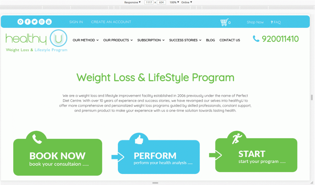
The following picture is an example of a responsive design for an electronic store that we designed for one of our customers (see the compatibility of the content
displayed with the available screen size).
In contrast, you can see this image of an e-store with a simple, non-responsive design.